St Paul’s Cathedral Brand Identity
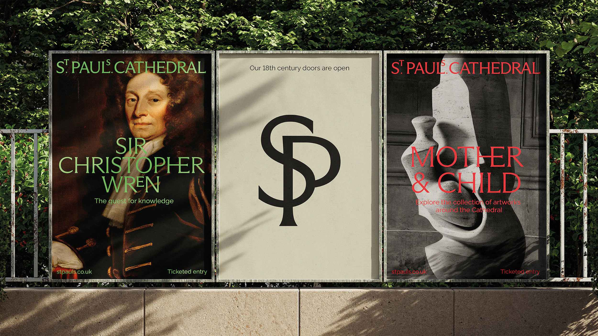
Pentagram’s identity for St Paul’s Cathedral does far more than make a historic institution look contemporary. It turns the cathedral’s history, stonecraft, typographic memory and civic role into the structural basis of a new visual system. The result is not merely a refined logo, but a coherent identity that reorganises how the institution appears, communicates and is remembered. One of the project’s strongest decisions is the way the wordmark reinterprets historical references without imitating them. The elevated “S” and “T”, inspired by typographic details found in the Cathedral Library, create a quiet but distinctive character. History is not treated as decoration; it becomes raw material for a new design decision. Typography works as an expression of institutional personality rather than ornament. Arizona Flare brings together classical letterforms and contemporary serif details, while Raleway establishes a calmer secondary voice. The palette, drawn from stone, floors and mosaics, further connects the identity to the physical reality of the building. The project is valuable because it demonstrates that strong identity for a cultural institution is less about attracting attention than about producing belonging, continuity and character. In this context, timelessness emerges when form and meaning genuinely support one another.
View source ↗Back to references